The aim of this project is to: "photograph people within their own surroundings to portray an essense of them".
Environmental Portraiture involves capturing a person, or people in a place that tells us something about them. Ultimately, the term 'work, rest and play' outlines an individual's life, which is built around their occupation, their well being and their hobbies. Whilst the environment generally plays a bigger role in the photograph, ideally the composition should show an important connection between the subject and the environment. It can only be considered as environmental portraiture if the subject is aware the picture is being taken, otherwise it slips over that fine line into documentary photography.
---------------------------------------------------------------------------------------------
Photographer [1] - Arnold Newman

Leonard Bernstein, Philharmonic Hall, New York, 1968
"I wanted to say something about these people, about where they lived, how they worked, or at least an indication"
Considered the father of Environmental Portraiture, Arnold Newman has photographed important historical figures dating back to the late 1930's, his work ranging from leading artists such as Picasso to a string of highly achieved, US-dominating presidents like John F. Kennedy and William J. Clinton. Working solely with a large format camera, Newman's work is significantly the opposite of documentary photography because the scene before the viewer is very obviously and cleverly composed to show that distinct connection between the subject and it's surroundings. They are also evidently environmental portraits because the subject's gaze is direct, overtly inviting the viewer to their story. He states in one interview, "I'm interested in what motivates individuals, what they do with their lives". One of his main influences throughout his photographic career was Walker Evans.
Some photographer's he has successfully managed to photograph:
- Man Ray
- Berenice Abbott
- Ansel Adams
- Henri Cartier-Bresson
- Paul Strand
- W. Eugene Smith
---------------------------------------------------------------------------------------------
Photographer [2] - Mitchell Kanashkevich

Romanian man making 'Tsulca' (traditional alcoholic drink), rural Maramures, Romania, 2009
"Usually I like to chat with the subject; if I don't chat, I at least make some contact"
"Usually I like to chat with the subject; if I don't chat, I at least make some contact"
Mitchell Kanashkevich is actually a travel/documentary photographer who favours the 'disappearing ancient cultures', which is why you'll find most of his work to be very exotic. He explores places where inhabitants live off the land, prolonging centuries of traditions and beliefs instead of getting caught up in our technologically advanced world today. Some of his main influences include: Steve McCurry, Sebastio Selgado, Henri Cartier-Bresson alongside that of Olivier Follmi and James Nachtwey.
Although he is a travel/documentary photography, I still consider this to be an environment portrait because whilst he is technically working, he is aware that the photograph is being taken and holding his gaze towards the camera. The man faces this way but his body is turned away, showing that he is still engaged with what he is doing or was doing before the photo was taken. The scattered wood paired with his smiley face tells us he doesn't take life too seriously, he enjoys what he does and is happy for us to join. I think overall, the image is a nice contrast to what we're used to.
Some Equipment he used:
[Body] Canon EOS 5D Mark II
[Lens] Canon EF 24-70mm f/2.8
[Lens] Sigma f/1.8
[Flash] Canon Speedlite 580 EX II
Portable, foldable softbox
[Body] Canon EOS 5D Mark II
[Lens] Canon EF 24-70mm f/2.8
[Lens] Sigma f/1.8
[Flash] Canon Speedlite 580 EX II
Portable, foldable softbox
---------------------------------------------------------------------------------------------
Photographer [3] - Gavin Gough


A musician in traditional dress at the Tamshing Monastery Tsechu Festival, Bhutan
Man selling onions and potatoes at the Mandi Spice Market in Udaipur, Rajasthan (India)
Like Kanashkevic, Gavin Gough is a freelance travel photographer, currently based in Bangkok. There are other examples of his work undertaken in many South-East Asian areas, including Bali, Bhutan, Cambodia, India, Laos and Nepal; all of which carry a running cultural theme. On his website he quotes, "my studio is the world outside my door, lighting becomes courtesy of what is available; sun, sky, tungsten and neon", and in an interview describes how he is inspired by Don McCullin's sense of connection he makes with the subject.
DENOTATIONS + CONNOTATIONS
Some Equipment he used:
[Body] Canon EOS 5D Mark II
[Lens] Canon EF 16-36mm f/2.8
[Lens] Canon EF 24-70mm f/2.8
[Lens] Canon EF 70-200mm f/2.8
[Lens] Canon EF 85mm f/1.2
[Lens] Canon TS-E 24mm f/3.5
[Flash] Canon Speedlite 580 EX II
[Body] Canon EOS 5D Mark II
[Lens] Canon EF 16-36mm f/2.8
[Lens] Canon EF 24-70mm f/2.8
[Lens] Canon EF 70-200mm f/2.8
[Lens] Canon EF 85mm f/1.2
[Lens] Canon TS-E 24mm f/3.5
[Flash] Canon Speedlite 580 EX II
---------------------------------------------------------------------------------------------
My Proposal
This project is so vast, but still quite restricted and will entail a lot of similar ideas amongst peers, so I decided to brainstorm ideas and suggestions, ensuring I had a variety to choose from and furthermore conjure a more unique one. Given the time limit, staying local would be a lot more realistic; it may be easier, but I'm hoping this means I will be able to produce better quality images.

My initial plan was to use individuals of my own age and show what they're currently doing with their lives, particularly during such an economic downfall which highly affects our generation. The idea was to use a mixture of males and females, but with very different roles in life. For example, I know someone my age who is pregnant and expecting twins, I know quite a few people at uni and then there's those travelling and working; but of course, I can't use people I know. The difficulty in this was finding people my age that did very different things.. it would have been more appropriate to do an age range, like 16-20yrs. I then thought about comparing people at each age milestone (16, 18, 21, 30, 40, 50 etc) because each are affected by the economy in very different ways. I think with an idea like this, it's very easy to put across my own opinion about such an issue.
Seeking advice from some peers, they asked me about my work and what I did. I work at the 'American Express Community Stadium' (Amex), so it was suggested that I take pictures of the footballers, considering I do see them a lot while I am there and no-one else would or even could do. When I asked, I was denied permission because of the bad press that has been going around recently about a number of the players. I then started to think about photographing the football fans, time becoming very limited obviously as I would only be able to undertake this on a match day.
Practice Makes Perfect...
 This week we were told to bring our camera's in to practice the technique of asking strangers to take their photo. We were told there should be a comfortable connection between the photographer and the 'model', and not to be afraid to direct them, as they would probably prefer to be told what to do to avoid standing there awkwardly. I found the most useful advice was explaining who you were and what it was for; there was even one certain case where the person was very reluctant, so I persuaded them by saying it wasn't going to be used anwhere, no-one was going to see it, it was just a personal project I was working on. At first, there was some apprehension; I'd never done it before and I'm not much of a portrait photographer, but after the first one, it came with ease. I find it easy to socialise with people, so for me it was an advantage and I was lucky to get quite a few shots within the hour, with only one rejection. I think the result isn't bad for a first attempt, some better than others; I like variation and here there is lots of choice in terms of lots of different types of people and their jobs, not necessarily lots of photo's. When I started editing some in Photoshop, I discovered there wasn't much colour cast at all, however the lighting was only a little excessive in the images of the man outside with the sunglasses, so next time I am photographing in daylight, I may need to consider adjusting the camera settings.
Websites
I decided to look at websites outlining more details about how to make an effective environmental portrait, because photographing people and photographing them well isn't my strongest topic.Practice Makes Perfect...

Websites


This website is particularly useful on basic information about the different types of specialist location photography. For a successful photograph, it's ideal to have knowledge of the 'specialist subject'. On this site, it talks about how people in Fashion & Editorial Photography like to place their subject in an environment that isn't their own, and then on the Travel & Documentary section it explains how it is the complete opposite as the subject is photographed in their natural environment. Included is an article about how to approach strangers, and even compares the advantages of Telephoto vs Wide-Angle as well as Black/White vs Colour to achieve the effect you want.

The other 2 websites offered great advice on the application of taking an environmental portraiture shot. One of the most important things highlighted was 'Get To Know Your Subject', to get them talking and find out things about them, what they like, what's their job etc. This would help you decide on the location of your shoot because it's got to say something about that person as well as make the subject more relaxed. Another thing that came up was "Props"; it's not always obvious just by the clothes they're wearing and may need some sort of object that helps the viewer to establish who and what they are about.
---------------------------------------------------------------------------------------------
Historical Context & More...
Lately we've been working on denotations and connotations on images to establish not just what it shows, but a deeper, more obscure meaning behind them.

In simpler terms, a denotation is what you actually see infront of you, literal objects. A connotation is what those objects symbolise, the concept being to make consecutive links so that what you end up with is never what you would initally think when looking at that object. Here are some examples that coincide with the theme of Environmental Portraiture.
Robert Howlett
Isambard Kingdom Brunel, 1857
Isambard Kingdom Brunel, 1857

This image is considered the first example of Environmental Portraiture. Brunel was a very well noted British engineer, his fame ever-increasing as he came to build such things like The Great Eastern Ship, The Clifton Suspension Bridge and also The Rotherhithe Tunnel (which was the first tunnel to run under the River Thames, London). Unfortunately he died shortly after the image was taken; coincidently, so did the photographer.
CREASED, MUDDY CLOTHES indicates that he likes to get stuck in, he is doing as well as watching and wants to get involved. The TOP HAT and HEELS reinforce that appearance is not important, at least not as much as the hands-on job, which is also recognisable in his LOUSY POSTURE as there is no attempt here to make himself presentable unlike most other men of stature. He seems to have that non-caring attitude as if to say "I don't want to be photographed, but if I have to", and the HANDS-IN-POCKET gesture suggests a certain degree of confidence, like he won't take any nonsense from anyone. He is wearing a CRAVAT, giving a sense of sophistication; debonair springs to mind, and finally I think the CHAINS in the background not only defines exactly what he is about and what he does, but the links symbolise the act of holding things together which I think is a slight reference to the man's personality and his role; he holds everything together.
Mathew Brady
William Tecumseh Sherman, 1865

William Sherman was a General in the army, highly thought to have helped bring the civil war to an end by marching his army from the North to South America, destroying absolutely everything in their path. He was sick of fighting, and even had a tank named after him during World War 2. When asked to be president, he replied "No way in hell. I do what I do and no less".
In this image, Sherman is SITTING very upright to exert his importance which is also reflected in the MEDAL that he appears to fashion, illustrating a ranking so superior within the army. Whilst his FOLDED ARMS predominantly show impatience, there is a feeling of uneasiness present; remembering of course the war is only just over, and so the INDIRECT GAZE could be a sign of ignorance but I think it is moreso cautiousness, like looking around the corner and always being on the ball. The SCRUFFY HAIR could imply that he doesn't care, but also a reminder of a man so courageous who endured some terrible things in his life. There is a BLACK BAND on his left arm which denotes the mourning of somebody's death; in this case, Abraham Lincoln, who was assassinated.

---------------------------------------------------------------------------------------------
Photographer [4] - Lewis Hine

Lewis Hine was a pioneering American social documentary photographer of the early 20th century whose work demonstrated his rational approach to issues of child labour and immigration. At the time, it was common for children at the age of 5-6yrs to be working in factories and sweatshops. Hine highly disagreed with the country's child labour laws and as a willing employee of the National Child Labour Committee in 1908, began to investigate the social and political changes during a time where there was attempt to make child labour illegal, as well as the poverty of young people. Whilst the majority of his time was spent sneaking into the factories, his images truly captured the reality of these conditions.
One of the first things that strikes me about this particular image is the symmetry; her arms at equivalent angles and the verticals of her blouse running in line with that of the window and the wall edge. In general, symmetry means balance - she is balancing herself between the two barriers, she is balanced in the centre of the image, however I think deeper meaning suggests she is in sync with everything around her, including the photographer. Half of the girls face is lit and the other half is in shadow which brings to mind the idea of a split personality, which is actually an illness consisting of symptoms such as depression, sudden anger, panic attacks and flashbacks most commonly linked to child abuse; all easily linkable to the conditions in the factories. Yet, it's balanced out by her vacant expression to say she's not giving anything away. The image is of narrow depth of field, the background being out of focus may imply a past fading away. Maybe it's a positive sign that the trauma disappears because the new laws concerning child labour have been put into operation, or are about to be.
---------------------------------------------------------------------------------------------
Photographer [5] - Paul Morton

I was browsing Environmental Portraiture on Flickr and came across Paul Morton's work. There was a link to his website on which I discovered a few examples of this topic, including this man amongst the junk pile. I was particularly drawn to it because I thought the subject was very stereotypical against such a scene; he looks like an old fashioned, motorbike-loving, adrenalin junkie and sports the vehicles as if it is his collection - whether or not it is, I don't know. He is positioned centre of the image, enclosed by the junk as if trapped, which I think could refer to a 'mental' trap - like his life revolves around it and he can't break out of it. The scruffiness and beard could be a metaphor in itself suggestive of the junkyard; much like his surroundings, it gets old and dirty in time. In this way, he immediately becomes part of it, like a single living element within a world of inanimateness.
---------------------------------------------------------------------------------------------
Roy's Photographers
- Jim Rice... East end of london, photographed changes and decline of manufacture, often commissioned to photograph people
- John Goldbatt (1966)... from S.Africa
- Barry Lewis (1978)... photographed London, was commissioned
- Gordan Parks (1942)... American, commissioned to photograph sufferers of the Great Depression, project gained a lot of publicity, had to find different aspects and put people into context of how they coped
---------------------------------------------------------------------------------------------
Real Photo-Shoots (Contact Sheets)
For my final idea, I settled on doing a personal approach. The method of having to ask people actually how old they were before I could even take a picture proved a bit too tricky, and photographing footballers could have gone either way; unfortunately it didn't work in my favour. However, I am still going to undertake part of this project in the work place because it's a part of what I do, although I'm not taking pictures of myself - it will involve people I haven't spoken to that are representative of a few of the roles in where I work.
These are things I will have to consider:
> Lighting (daylight, tungsten, ambient...)
> Location
> Chosen models/candidates
> Expression & Posture
> Depth of Field
> Angle
> Positioning (Left, Right, Centre)
> Surroundings & Objects
> Equipment (Tripod, Flash, Lightmeter...)
> Timing
> Clothing
> Behavioural Aspects?
PLANS/DRAWINGS!!
1. The Bus Depot, Conway Street, Hove

I decided for one of my images to do bus-driver/s because the bus is something I use nearly every day, it's my main form of transport if I'm not walking somewhere. As a result, I consider it a main part of my life, it's gets me to places to be able to do the things that I do. My dad works as part of the Brighton & Hove Bus Company. As well as a bus driver, he has a higher and more important role within the company, so I asked him if I could come up and take photo's of the buses and driver/s for this project. It was easily sorted and I got to go on a tour around both garages and offices, meeting all different types of people. After being introduced I found it quite easy to direct my subject as I was eager to experiment with different angles as well as positioning them at different parts of the bus. It was even better when I was asked if I wanted to take photo's with them in front of different types of buses, coaches and even an old fashioned bus which apparently was a fortunate opportunity because they're very rare, you don't see them nowadays.
Without thinking, I made the mistake of forgetting to change the quality on my camera settings to NEF (RAW) and so will have to do the best I can with JPEG's. Unfortunately this means when it comes to printing, the quality won't be as good; some graininess will be apparent.

1 2
3 4 <-- Key: relates to images above
5 6
7 8
These are my favourite images. I think they best depict that of a bus-driver because it highlights ownership. I always feel like when they're driving, they are very proud and very in control because they are strictly liable for the safety of their passengers. Whilst there is variation in my images and variation in the personalities of bus-drivers, they all have one thing in common; they won't take nonsense from anyone.
There are pro's and con's to all of them, for instance, image 1 is very out of focus and he appears to be very happy or trying to contain his laugh, but the attention of the subject is good. The problem with image 2 is the reflection wipes out the content of the image, you can barely see the bus-driver because the sunlight penetrating the window from behind me is rebounding off the surface. I really like image 3 because we get the length of the bus, the company name and a bus-driver typically representative of it. He stands to the side of the lettering so we take in exactly what he is about, his posture not protective as such; inviting you on but still letting you know it's his. It's a shame about the excessive light hitting the right side of the bus-driver in image 5 because you can't change that or edit it out on Photoshop. However I like the fact that it's a face-on shot of the bus as if square with the photographer and then how the bus-driver leans against it casually like he is used to it, it's comfortable for him. The best shot for me would have to be image 8 because it's the ideal environmental portrait of that profession. He is seated somewhere he is familiar with, where he is in complete control; the steering wheel, the gear stick, the buttons that open the doors and release the ramp, the ticket machine... even the cashier positioned nicely on top of the barrier that separates him from his passengers, exerting a strong sense of dominance. His expression says he wants a straight answer and his body positioned away suggests that he is acknowledging them but not giving himself to them fully. The surroundings of the bus structure immediately helps the viewer to distinguish what he does.

FLASH: For these particular shots, I had to use flash. I used the 'pop-up flash' on my camera because I wanted direct light which turned out ok, but not great; it was reflected more in the driver's high-vis jacket. I got him to stand at the back of the bus, almost to suggest that his work is in front of him which may entail that his work comes before him. The top right image is the best of them because it lights up the entire inside of the bus.
2. The Amex Stadium, Falmer

Another aspect of my life is work. I work at the Amex Football Stadium, predominantly as a waitress but have done pretty much every aspect concerning many of the hospitality roles. I've undertaken bar-work, worked the kiosks and set up massive rooms for match days as well as major corporate events. As the project involves photographing strangers, I had to find people I didn't know/hadn't spoken to. Luckily, the day I decided to take these images our section was understaffed, so they called in some new people from agencies - perfect opportunity.
(need to write up the rest!!!)

The Editing Process
 1. Change the workspace to Photography
This provided me with all the necessary palettes I would need to edit my pictures.
 2. Correct colour casts the quick way by selecting Auto Colour
The only reason I did it this way was because I was stuck for time and needed a simple method to correct them. There wasn't much change in this example, but for others you could see the highlights change significantly to whiter tones, this making it easier to work with.
 3. Create a New Adjustment Layer and select Channel Mixer from the list
Once on channel mixer I clicked the monochrome tick box to convert the image to black and white. This is the correct way to ensure that Photoshop doesn't alter the colours and tones.
 4. Create a New Adjustment Layer and select Curves from the list
Curves is one of my favourite tools to use because you can create all different types of effects, particularly with black and white images where you can make them look metallic and solid. I selected the appropriate level of contrast from the drop-down menu to ensure the image wasn't too dark or light, but exaggerates detail.

The Editing Process

This provided me with all the necessary palettes I would need to edit my pictures.

The only reason I did it this way was because I was stuck for time and needed a simple method to correct them. There wasn't much change in this example, but for others you could see the highlights change significantly to whiter tones, this making it easier to work with.

Once on channel mixer I clicked the monochrome tick box to convert the image to black and white. This is the correct way to ensure that Photoshop doesn't alter the colours and tones.

Curves is one of my favourite tools to use because you can create all different types of effects, particularly with black and white images where you can make them look metallic and solid. I selected the appropriate level of contrast from the drop-down menu to ensure the image wasn't too dark or light, but exaggerates detail.
Of course the editing process will vary amongst different images because they'll need retouching in different ways. The kitchen porter was the hardest to edit because generally the image was very underexposed, yet the background through the window was very overexposed so I had to do a lot of criss-crossing of burning-in and dodging to achieve the correct exposure. Some of the images needed the 'linear-contrast' and others need the 'medium contrast' when it came to the Curves layer, which was all dependant on the level of highlights and shadows in the image. In a couple of the images I used the 'spot-healing' tool to get rid of unwanted parts, though it was never on the subject due to ethical issues. A lot of retouching facial and bodily features occurs in commercial photography.
---------------------------------------------------------------------------------------------
Final Images
(need to write up final images!!!)
THE BUS DRIVER

THE WAITER

THE MANAGER

THE KITCHEN PORTER

THE BAR-MAN

THE GUITARIST


THE BUS DRIVER

THE WAITER

THE MANAGER

THE KITCHEN PORTER

THE BAR-MAN

THE GUITARIST

Vignetting
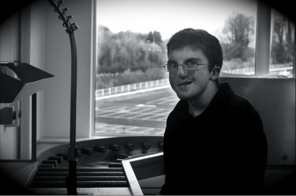
In photography, vignetting is caused by a reduction in light at the edge of the lens. As a result, we get softer edges as the light gradually fades out. The corners become dark/black because they are completely saturated. Sometimes done accidentally, but it is easily achievable when editing images if you want to create a certain effect. To me, it gives the impression of someone spying and I think it only works with specific types of images. I tested it out on one of my images - I think it works quite well as a general image, but because the theme is environmental portraiture and the subject is aware of the photo being taken, it doesn't tie in with the concept of 'spying'.
---------------------------------------------------------------------------------------------
Evaluation
The decision of my topic was very difficult because I changed my mind a lot and it was only about 2 and half weeks into the assignment that I settled on photographing people doing things that are respresentative of myself; my previous ideas were either impossible or too demanding in the time limit we had. Of course, by this time I only had about 2 weeks left to develop my idea and shoot my subjects. One of the disadvantages of this was that I decided to incorporate my workplace into the project, but as I could only go in on a match day, the task was very restricted, especially as there were only 2 match days in the time I had left. Even worse, I couldn't shoot the second time because everyone, including myself, was just too busy and by the time I could, the people I wanted to photograph had left.
By researching the photographers that I did, I've learnt that to make a successful environmental portrait, there undoubtedly has to be that connection present. If you want it to have an effect on the viewer, the most powerful way is producing something in which they can relate to. I found that getting to know the subject really did help them to relax and also gave me more confidence in directing them and the ability to experiment more so that I got better shots (moreso with the bus-driver photo's).
One of the most practical issues of producing the photographs was lighting, infact it was the predominant struggle in all shoots. In the bus-driver images, it was quite dark inside the garages with the main source of light coming from behind me when I was taking the pictures. It would have been ideal to take my tripod with me to prepare for that, so that was my own fault. There was one occasion where I had to use the 'pop-up flash' in order to light up the inside of the bus so you could actually see that there was a person standing at the back of it. The images at work proved to be quite overexposed due to that combination of artificial indoor lighting and the invading daylight through the windows. I should have adjusted the camera settings to accommodate this, but I did my best in Photoshop to get over this hurdle. Also at work, I don't feel that for some of the images the environment was entirely characteristic of the subject's job role. When I realised this during the shoot I positioned them elsewhere so that the 'props' as such gave some sort of indication as to what they do.
My intentions for this project weren't completely met, which I think is due to time management. If I'd brainstormed more ideas a bit earlier than I did, it would have broadened my options, my final outcome and the research that coincides with it. For the images of the bus driver, I think there were even some better than I expected to get and I think overall next time I will plan better the equipment I need, the lighting, the time of day, indoor/outdoor as well as leave myself plenty of time to re-shoot and adjust if needed.
There are a lot of improvements I would make to my work, including properly setting up a subject within their environment, much like Arnold Newman did. This way, you can position them and the things around them to get a much more effective shot. I would also prepare for different lighting conditions because you never know what it will be, especially if you're outside on location and having to manage light that isn't even in your control. Furthermore I would also practice more with flashgun's; I don't fully understand them but I feel that in certain situations the use of flash would benefit it greatly - examples I particularly like of this are that of Philip Lorca DiCorcia. My main improvement would be to manage my time better as it takes time to get a perfect shot, and that's with all the necessary equipment in place.
Marcus says:
"Is there a reason why they all seem to be male? Is it due to their jobs? My favourite is the man behind the bar."
Sophey says:
"This series of photographs are really good environmental portraits; I found that one of them, 'The manager' was more of a portrait, than an environmental portrait. I found that the 'Bus driver' was beautiful, and used the location perfectly. The lighting was lovely."
1. How did you decide on the topic?
2. What have you learnt by researching relevant photographers/artist? How have they related to your practical?
3. What were the practical issues of producing photographs? (e.g. choice of location, B/W, digital/tradition, lighting, printing techniques, materials used)
4. Comment on your intentions. Did you achieve what you wanted?
5. What improvements/changes would you make?
6. What do you feel you've learnt and achieved? Anything you're pleased with?
7. Peer assessment? What do other people think?