Research
Portraiture extends centuries back; originally discovered through the medium of painting. Here, I will briefly compare the popular trend of portraiture from late 1500's to its contemporary uses.


---------------------------------------------------------------------------------------------------
Yousuf Karsh - John F Kennedy, 1960

"Within every man and woman a secret is hidden, and as a photographer it is my task to reveal it if I can"
Yousuf Karsh, famously known for giving us insight to the lives of people such as J.F Kennedy (above), Ernest Hemingway, Pablo Picasso and Albert Einstein, tends to use dramatic lighting in order to emphasise what he wants us to see. When discussing this particular image, it was stated that he likes to make use of the person's hands in his work because they somewhat narrate the emotional state of that person. A good example of this is a popular interview technique where someone's nerves becomes apparent if their hands are shaking or sweaty. As someone of absolute power, there is a grace about the way he clenches his hands together; he appears open and friendly. We don't know what he is looking at exactly, we can only guess it is something or someone that is drawing his attention or Karsh is making him appear as if he is; either way, there is a thought process apparent here in his gaze. The tonal range is quite bland - maybe this is a characteristic of him, showing that if the portrait itself doesn't tell us much then maybe the technicality and process behind taking the picture does. He is of side profile, therefore he is important - we know who this man is without seeing him face-on. If we didn't know this was the President, we would automatically assume he is something of a very successful business man/lawyer/politician by his clothing and the way he holds himself, he is very straight and very certain.
Steve Pyke - Keith Richards

"Our faces speak realms about our identity, anchor us to our histories and absorb the passage of time"
This image is part of the series 'Faces of our Time' where Steve Pyke focused on figures that he felt made a considerable contribution to the history of age. Classification once again is a key element in his work and is one of the first photographers to cut through the subject's forehead. In an interview, when asked how he implements personality into the portrait, he said, "I engage my sitters, we speak for far more time than I photograph - at certain points in our conversation, I will photograph. I hope it creates spontaneity." Again, side profile is used to suggest this is a person of importance, which it is as he is a musical legend but it also reveals a great deal of identity. I feel that the structure of his face and less than caring attitude as he lights up a cigarette in a studio (which isn't allowed) tells us a lot about the person he is. Pyke was very well known for getting really close to his subjects, his fascination with the face becoming apparent as he photographs inches away from them. Some would question if you were allowed to do this with someone so famous, breaking the boundaries may have consequences; it is suggesting that getting close to that person means you have a close relationship with them, there is a certain degree of familiarity. In a situation where you are photographing someone with status, you have to consider the parameters - we have a lot closer proximity to our family because we know them.
Rineke Dijkstra - Teen Soldiers, 2000

"I am interested in the paradox between identity and uniformity, in the power and the vulnerability of each individual group"
I was very drawn to this work of Rineke Dijkstra because the idea of transition has always interested me. I like the fact that even the smallest change can have a dramatic impact, and in this series of Teen Soldiers Rineke has done just that. It's like having someone placed at the complete opposite end of the spectrum and highlights the concept that you never really know a person until such a transition takes place. They have turned into someone else, it's a new start with new opportunities and new challenges.. this minimal decision to join the army has suddenly changed his life path completely; this man will never meet the people he is soon to meet if he were to stay as and where he was before he joined. This is what fascinates me; the unknown and what could have been if this or that hadn't happened, and this is all down to the choices we make in life. It now becomes a conceptual portrait as you begin to wonder whether they are the same person. In some ways, it seems so. For example he stands with the same confidence, his stature still tall, somewhat broad shoulders with a facial expression that says 'don't mess with me'. In other ways, he appears different - like his shaven head and even uniform to imply a rank within the army makes him that extra bit more intimidating now, but for all we know he could be the most caring, sensitive person in the world. This goes to show that looks can be deceiving. I think she has captured that instant moment of shift to adulthood remarkable. He is, as she states, a "changing identity".
---------------------------------------------------------------------------------------------------
Unit 24: Photographic Studio Techniques
Medium & Large Format
This part of the project requires evidence of knowledge and application of a medium and large format camera. They are operated in very similar ways, but with the medium format you get 10-12 frames whereas with the large format it is just 1 frame.

This part of the project requires evidence of knowledge and application of a medium and large format camera. They are operated in very similar ways, but with the medium format you get 10-12 frames whereas with the large format it is just 1 frame.
Medium Format

Medium format cameras come in all shapes and sizes, the most common being SLR (single lens reflex), TLR (twin lens reflex) and Rangefinder. Whilst it is cheaper than a 35mm, it holds far fewer frames. There are lots of advantages to these cameras, a major one being versality - you can get many different parts of them, including interchangeable backs (you could, for example, have 4 different backs and a polaroid back for 1 film roll). The quality is alot better, not only because the frame is larger and more detail can be recorded, but actually taking the photo is slow to compose - slowing you right down and make you think about what you're doing.
It does also come with it's disadvantages. Firstly it's quite heavy, I couldn't imagine lugging it around along with multiple lenses, films, tripod and everything. Within it is also a large mirror which can give vibration, thus there is camera shake. As there is no light meter, getting one is an added expense.
 The large format camera is totally unique because of movement; more specifically the extent of it via bellows. These movements are controlled by locking mechanisms and there are 3 types:
1. Swing Movement - move the front + rear square boards side to side
2. Tilt Movement - move the front + rear square boards forward and backwards
3. Slide Movement - move the front and rear square boards up and down
Why use it?
Because it is such high quality for a start and you can completely change the plain of focus (change which parts are in focus by moving the front) as well as change the shape, simply by moving the back. The image is also viewed here on the back by a focusing screen which takes the form of a grid pattern to aid framing accurately and line things up. It also displays the image upside down and back to front.
Experimenting with Large Format
There are 2 types of large format: Mono Rail and Flat Bed/Technical. For my experiment I used the Mono Rail. One of the main differences is that the film is one sheet and not a roll. Before going ahead with it, it helped me to familiarise myself with the camera, it's settings and functions; which dials were for what and how certain levers operated as well as practicing moving the front and rear standards for different effects.
Equipment needed:
- Model
- Chair
- Black back-drop
- Tungsten light
- Large format camera
- Tripod
- Lightmeter
- Cover
- Film
1. Position model as desired (see 'My Idea' section for diagram of arrangement)
2. Take a light meter reading, ensuring it is at the correct angle in conjunction with the light and the sensor on the camera
3. Apply these readings to the camera by turning the appropriate dials
4. Look on the focusing screen - the image of the model should be upside down and back to front
5. Take the cover and place over your head and the camera (but not the lens otherwise we won't be able to see the model). Use a combination of Crude Focus and Fine Focus to get the image as sharp as possible
6. Remove the cover and cock the lever that fully closes the aperture. This is so no light is exposed when you insert the film
7. Insert the already loaded film holder
To load film holder: you have to be in total darkness, just as though you were processing a standard 35mm film. Remove 1 sheet of film from all packaging and find the notch cut in the top right corner - this determines that the film is the right way up, emulsion side up. Pull dark slide up and lift one of the flaps at the bottom of the film holder; slide the film in so that the notch cut goes through first. Rest the film on two plastic grooves at the bottom of the film holder as this is an indication that the film is completely in. Close flap and push dark slide back down so it locks the flap in place and swing the small metal prong at the top of the film holder round so it again, locks the slide in place.
8. Cock the lever on top of the lens to prepare the shutter
9. Remove the film holder's dark slide - if loaded correctly, the emulsion side should now be facing the model
10. When ready, push the shutter release downwards
11. Before rushing anything else, put dark slide back in so that the black rim is facing outwards (indicates an exposed film as the film holder can actually hold 2 films at a time) and slide the prong back round.
12. Remove film holder and proceed to process
It is CRUCIAL that the model remains as still as possible throughout. Any slight movement can hinder the process and you'll have to restart the whole thing again.
It does also come with it's disadvantages. Firstly it's quite heavy, I couldn't imagine lugging it around along with multiple lenses, films, tripod and everything. Within it is also a large mirror which can give vibration, thus there is camera shake. As there is no light meter, getting one is an added expense.
Large Format

1. Swing Movement - move the front + rear square boards side to side
2. Tilt Movement - move the front + rear square boards forward and backwards
3. Slide Movement - move the front and rear square boards up and down
Why use it?
Because it is such high quality for a start and you can completely change the plain of focus (change which parts are in focus by moving the front) as well as change the shape, simply by moving the back. The image is also viewed here on the back by a focusing screen which takes the form of a grid pattern to aid framing accurately and line things up. It also displays the image upside down and back to front.
Experimenting with Large Format
There are 2 types of large format: Mono Rail and Flat Bed/Technical. For my experiment I used the Mono Rail. One of the main differences is that the film is one sheet and not a roll. Before going ahead with it, it helped me to familiarise myself with the camera, it's settings and functions; which dials were for what and how certain levers operated as well as practicing moving the front and rear standards for different effects.
Equipment needed:
- Model
- Chair
- Black back-drop
- Tungsten light
- Large format camera
- Tripod
- Lightmeter
- Cover
- Film
1. Position model as desired (see 'My Idea' section for diagram of arrangement)
2. Take a light meter reading, ensuring it is at the correct angle in conjunction with the light and the sensor on the camera
3. Apply these readings to the camera by turning the appropriate dials
4. Look on the focusing screen - the image of the model should be upside down and back to front
5. Take the cover and place over your head and the camera (but not the lens otherwise we won't be able to see the model). Use a combination of Crude Focus and Fine Focus to get the image as sharp as possible
6. Remove the cover and cock the lever that fully closes the aperture. This is so no light is exposed when you insert the film
7. Insert the already loaded film holder
To load film holder: you have to be in total darkness, just as though you were processing a standard 35mm film. Remove 1 sheet of film from all packaging and find the notch cut in the top right corner - this determines that the film is the right way up, emulsion side up. Pull dark slide up and lift one of the flaps at the bottom of the film holder; slide the film in so that the notch cut goes through first. Rest the film on two plastic grooves at the bottom of the film holder as this is an indication that the film is completely in. Close flap and push dark slide back down so it locks the flap in place and swing the small metal prong at the top of the film holder round so it again, locks the slide in place.
8. Cock the lever on top of the lens to prepare the shutter
9. Remove the film holder's dark slide - if loaded correctly, the emulsion side should now be facing the model
10. When ready, push the shutter release downwards
11. Before rushing anything else, put dark slide back in so that the black rim is facing outwards (indicates an exposed film as the film holder can actually hold 2 films at a time) and slide the prong back round.
12. Remove film holder and proceed to process
It is CRUCIAL that the model remains as still as possible throughout. Any slight movement can hinder the process and you'll have to restart the whole thing again.

I scanned my negative in using the Hasselblad Imacon Scanner, changing the appropriate settings for instance, the size of the film and RGB. At first it came out very orange because of the powerful tungsten light used in the shoot, but this can easily be converted to black and white. Whilst the result is not perfect, it was still successful. It doesn't have the high quality that you typically get with using large format, but this is down to my own application and faults when using it - there was either camera shake or the subject moved so if I continued experimenting, this would be something I would improve on. There are some speckles too which can be removed and the highlights in the face are very overpowering so some detail is lost. Despite all of this, you get the gist of my idea; her face against the background a somewhat reversed silhouette. There is a good range of highlights and shadows in the hair and detail is plentiful here.
Why I won't be using medium or large format for my final images...
Simply because of expenses. Neither film nor paper comes cheap and I haven't practiced enough to feel assured that I won't make mistakes and risk wasting my money or resources. It's not worth jeopardising my entire project in the time limit we have, but the experience was fun, interesting and a good insight into the original practice of producing photographs.
---------------------------------------------------------------------------------------------------
My Idea
My biggest influence for this project was Bettina Von Zwehl. As someone who has always had very little interest in portraiture, I was surprised that I quickly became fascinated with her work; her methods to eradicate complete falseness amongst one's character presented intense and somewhat uncomfortable results. Von Zwehl developed a very unique technique which involved coordinating a situation where the subject was unable to control their representation. It meant that she would photograph them in a way that epitomises a general state of well-being that we, as humans, endure in every day life. Examples include:
1. Just woken up from a deep sleep
2. Drenched in water
3. Holding breath underwater (captured at very last moment of breath)
4. Recovering from physical activity
What I liked about it is that element of surprise. Every person she photographed was semi-oblivious to the distressing situation they were about to be put in; they may have known what was going to happen, but they certainly didn't know when and therefore incapable of preparing themselves. Her most famous series 'Alina' involved 12 young women, all of similar age sat infront of a monochrome background. However, they were positioned in complete darkness; only the photographer knew when the picture was going to be taken, thus takes the form of the individual's utmost pensive state.
My idea is based on another of Von Zwehl's series where the subject is of side profile.
 These 2 people are complete strangers. They have never met, yet there is a strong connection between them, like they have known each other for a long time. They are at the same eye level here as if square with each other, their gaze intense and the position of their body perfectly mirrored - the cleverness behind this stems from the fact that they are two very different and separate images. Anyone looking at this would think they were in the studio at the same time. The colour of their tops almost disguises them against the backdrop here which makes me wonder if there is a subliminal message; maybe there is something they are hiding or maybe they just want to blend in.. possibly blend in with society? Perhaps these subjects were specifically chosen as people that feel like something is out of place.
I want to reproduce this style, but with my own quirks. Firstly, I am not drawn to high-key lighting because I think it's very fashion and product orientated, almost like it's trying to sell you something. As you can see from the research above, I have specifically chosen images that show a side profile. It's thought that photographing someone from the side gives them status; you can recognise who they are, you do not have to see a frontal shot of them to recognise them. The classic and most famous example of this is the Queen's face on currency and stamp.


This is my plan for the studio (right)...
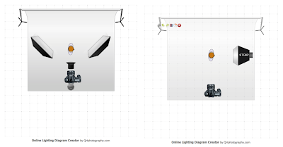
The technicality is probably of simplest form, but I believe it is also one of the most powerful. The arrangement is parallel; lined up deliberately to capture the light at that angle and designed to shine a light on someone, not just literally, but metaphorically as if to open their character. Unlike my analysis of Von Zwehl's work where I mentioned they may be people trying to blend in, my images should evoke people that stand out.
My Idea
My biggest influence for this project was Bettina Von Zwehl. As someone who has always had very little interest in portraiture, I was surprised that I quickly became fascinated with her work; her methods to eradicate complete falseness amongst one's character presented intense and somewhat uncomfortable results. Von Zwehl developed a very unique technique which involved coordinating a situation where the subject was unable to control their representation. It meant that she would photograph them in a way that epitomises a general state of well-being that we, as humans, endure in every day life. Examples include:
1. Just woken up from a deep sleep
2. Drenched in water
3. Holding breath underwater (captured at very last moment of breath)
4. Recovering from physical activity
What I liked about it is that element of surprise. Every person she photographed was semi-oblivious to the distressing situation they were about to be put in; they may have known what was going to happen, but they certainly didn't know when and therefore incapable of preparing themselves. Her most famous series 'Alina' involved 12 young women, all of similar age sat infront of a monochrome background. However, they were positioned in complete darkness; only the photographer knew when the picture was going to be taken, thus takes the form of the individual's utmost pensive state.
My idea is based on another of Von Zwehl's series where the subject is of side profile.

I want to reproduce this style, but with my own quirks. Firstly, I am not drawn to high-key lighting because I think it's very fashion and product orientated, almost like it's trying to sell you something. As you can see from the research above, I have specifically chosen images that show a side profile. It's thought that photographing someone from the side gives them status; you can recognise who they are, you do not have to see a frontal shot of them to recognise them. The classic and most famous example of this is the Queen's face on currency and stamp.

I want to give my subject a sense of importance by getting them to pose in the same way the Queen does here. This is not to suggest superiority; it is merely an attempt to portray equality amongst average people and those with significant power because in reality, no single one person is more valuable than another. Mimicking a character of extreme prestige implies that you are relating to them; you are able make direct comparisons and defying what we are naturally brought up to believe.
This is my plan for the studio (right)...

- BLACK backdrop
- Canon 5D
- 1 Soft Box
- Model
My actual idea is to have 2 different people that don't know each other, have never met and most likely will never come into contact with each other. The models will be of opposite gender, but similar age to show a visual perception of similarities and differences. I want them to keep a straight face, not to show someone who is emotionless or relinquish their personality, but to have them in their truest form - that is physically what they are, so suddenly it becomes a fascination with the human face. Whilst the expression should reveal nothing of their character, other elements such as hair (Is it dyed? Straight or curly? Long or short?) and clothing (Is it casual? Bright or dim colours? What style?) should give us subtle hints.
I am going to photograph them at the two extreme opposite ends of the frame initially, the photo's placed next to each other to enforce a mass of space between them. Empty black space. Together, the image will look like they are looking intently at each other, but the reality is they are looking at nothing; they are in the studio at different times.
The empy space can connote many different things, for example, a gap in their life. A seperation from each other that shows the interlude and hesitance of meeting a stranger which is contradicted by the intense gaze they will be sharing. For me, the space is a metaphor for the unknown, almost a passage of time to suggest that is how much time they have left. It is all the opportunies, challenges and experiences ahead of them in life, and the person at the opposite end marks the moment of ultimate achievement when they have got to where they want to be. This is what makes using young people so relevant because they still have their whole life ahead of them.
I think this image will also portray a sense of strength and rivalry with each other, like a battle of the sexes. We now live in a world where men are no longer the dominant sex. Feminism has changed the way women are seen as part of a society with rights to equal opportunities as men, particularly nociteable in the employment sector - how both gengers can have the same jobs. There has been a mild swap in gender role amongst many. So does this make it a competition? To show who is the stronger sex? Possibly, but they will be positioned at eye level and the same distance from the edge of the frame to exemplify that equality.
- 1st Shoot -

My first shoot was really just to practice the set up of my project. Although it's easy because there is only one light source, a lot of accuracy is needed in positioning the model. If they're too close, it blares on their face and if they're too far away it doesn't hit their face where I need it to. Same goes for the distance away from the camera as well as the angle at which the model is with the light. A lot of adjusting occured as evident in the different levels of light on the model. At first, I didn't have a lightmeter so there was a bit of guessing involved at the beginning. I managed to get hold of one and instead started manipulating the light output by increasing or decreasing and deciphering the strengh of the flash. You can see in two of the pictures that the flash completely overpowered her face, causing major overexposure that wipes out the detail and features. I also used this shoot to decide whether I wanted it to just be a head shot or if more body could be shown - but just the shoulders.
Portrait vs Landscape...
Portrait vs Landscape...


During my shoot, I indecisively kept switching between a portrait and landscape orientation to try and determine which best complemented my idea. I think that when people hear the term 'portrait' they automatically interpret it as something similar to the image on the left; everything the right was up, running verticals as the model sits or stands. However, for my project I want to emphasise space - everything that falls and exists between two people. The framing here will crop out the bottom half of that person, as if to suggest it is irrelevant. As a single image, we have to ask ourselves what they are actually looking at - is it someone? An object? Or merely the space present between them and whatever is ahead?
- 2nd Shoot -


Now that I knew how I wanted to light my subject and where they were going to be, I used this shoot to focus on the face; how it was posed and trying to obtain that blank expression. I also wanted to figure out a way of framing my subject so that it was consistent throughout and would be the same when photographing the other subjects for my project. To do this, I used the guides in the camera. I lined up the little squares (which flash red when that area is being focused on) with certain facial parts, for example, the middle square with the nose and the 2 squares further to the left lining up with the eyes and mouth - it was all about proportion so that all my subjects would fit perfectly in the frame. I applied this method when doing both portrait and landscape orientations. I think the result was very successful, I had a lot of images to choose from. It did come with it's technical difficulties though; for ages the sync lead wasn't working, resulting in several blank shots which wasted a lot of my time, but also there could have been even better shots amongst them. As I came to edit the images, one of my tutors commented on the very accurate highlights/shadows in Sophey's face (blonde girl) and then mentioned as an improvement, I could use a soft light behind her head so that the outline of her head comes through. There are examples of this in my first shoot (although not using another light, you can just see the outline of her head) but I think I quite like the fact that she is 'disappearing into the background' - referring back to the empty space and how it represents the journey that person is embarking on, the fact that she is disappearing into this space suggests that she is quite literally part of that journey, that experience.
Auto-Colour (Photoshop)...


This was done to demonstrate how useful the Colour Balance is in images. It is there to neutralise the colours and effectively remove colour casts that we often get when shooting. 'Auto-Colour' is a quick but inaccurate method of removing them, however I am just distinguishing the difference a colour cast can make. The white balance of the image on the left has been corrected, the effect somewhat eerie and ghostly due to the contrasting white face on black background. I want to stick with the warm, glowing mood of the orange-y colour cast in my original images. I think this is another way to reflect on someone's character, the image on the right making her seem like a much friendlier, positive and approachable person. Although for my finals, I have toggled with the Vibrance tool in Photoshop using contradicting techniques - I increased the vibrance to about 25% to make it perkier, yet decreased the saturation by approximately 20% which gave it quite an old feel.
- 3rd Shoot -

My final shoot went very smoothly because everything was exact. The lighting and positioning was set up with ease and the photo shoot went very quickly - I actually had to cut down the number of images because there were a lot that looked exactly the same. My subject was relaxed, knowing he wasn't going to have to pose and do certain things; just sit there and look directly at the light parallel to him. I would say they only issue with this shoot was not knowing how close I had to be to him, measuring the distance between and the subjects and I wasn't something that crossed my mind and looking back, I wish I had thought of it so that the frame was filled in the same way for all of them. I still experimented with portrait and landscape orientations just for variety. More than happy with the way these came out.
---------------------------------------------------------------------------------------------------
Final Images


---------------------------------------------------------------------------------------------------
Evaluation
My topic was decided pretty much when I was introduced to Bettina Von Zwehl's work. From the moment I learnt about her methods to extract the nature of someone, to represent them in way they couldn't control, I knew I wanted to photograph something similar. I didn't apply any of these methods to my own shoot because time was getting on and if I just the same, it's copying someone else's work - there would be nothing unique about it. Whilst my images do relate to hers in many ways, there are several more ways that I have made it my own which I think is more important. For example, keeping the colour cast, positioning them at complete opposite ends instead of right next to each other, using low key lighting, having them wear their own clothes as a sense of identity, but most important, the use of space and what that portrays to the viewer. It isn't this or that, it is simply what the viewer feels when they look at this.
There were very few technical issues because 1) it wasn't on location, the assignment was undertaken in the studio. 2) the arrangement was very simple, I had 1 light, 1 subject, 1 camera. The only trouble I ever had was the syncing of the camera with the light in the second shoot, but this was resolved as quickly as possible.
I feel that I have achieved what I set out to do, maybe even more. There isn't much I would change, I think that it was executed to the standard I wanted. I would maybe experiment with different types of people, things like age, ethnicities, strangers even as these were people I knew. Maybe the result would have been more powerful with someone I didn't know because they would take such a thing more seriously. I would also experiment was a different light, or multiple lights to see how the mood of the image is altered. I would maybe change the concept behind it too; for example using 2 people that absolutely hate each other and would never be seen in the same room together, placing their images so they are directly in front of each other with little space between them and they would never know. Or maybe have 2 completely different people that look exactly the same or very alike, but have no idea the other exists.
All in all, I am very pleased with the result. The final images, with editing, came out better than expected, and maybe if I had more time (and money!) I would have used more of the large format for this project, just to see how the quality and effect compares.